

The Paradox of White Space: Some Research and Examples of White Space in Web Design
White Space is a principle of layout and design well known among graphic artists, but less known and practiced among some technical writers. I have a deep interest in Web design, and white space seems to be one of the first, fundamental principles of design for both on and offline content.
Paradox of White Space
White space also has an interesting paradox surrounding it: The absence of graphics and text plays a significant role in increasing comprehension of the text and of focusing attention on graphics. The absence of content is what draws the eye towards content. The negative, blank space (which possesses nothing) creates a sense of sophistication and elegance. The sense of simplicity and absence of graphics and text is what contributes toward a richer, deeper and more complex artistic expression.
Authors on White Space
Below are a few excerpts from authors writing about white space.
This author notes that white space contributes to a sense of refinement:
In western culture we associate uncluttered spaces with good taste, refinement and affluence. It is also more restful to the eye to read or view items that have a generous amount of white space surrounding them. That is why museums always use broad white walls as a backdrop for paintings on display.
On the Web, white space is essential when the viewer is required to read large amounts of content. Generous margins and clear simple layouts make it easier for the eye to work. Cluttered layouts tire the eye quickly and hinder clarity. Also, just as in advertising, uncluttered layouts convey a sense of good taste and refinement. (Source: Newark1)
Newark1's site itself is a good example of white space. It seems to have a nice sense of balance as well.
This author also explains that generous white space creates a sense of luxury and elegance:
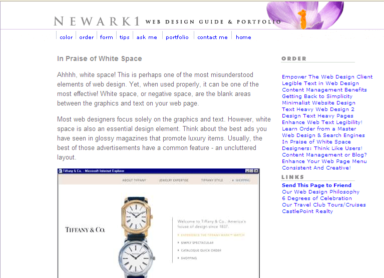
Designers use whitespace to create a feeling of sophistication and elegance for upscale brands. Coupled with a sensitive use of typography and photography, generous whitespace is seen all over luxury markets. Cosmetics, for example, use extensive whitespace in their marketing material to tell the reader that they are sophisticated, high quality, and generally expensive. (Source: A List Apart)
Here's a screenshot of the Tiffany & Co. jewelry site.

This author compares white space to breathing space, and uses the metaphor of blowing up a balloon to describe a healthy need for white space:
Today's web designs are so fresh, they feel like they've taken a deep breath. Sometimes I imagine taking a page design that's too crowded and sticking it on a balloon, then blowing air in until everything on the page pulls apart to leave healthy gaps. Your eye needs space (guttering in typo language) round stuff to help you clearly and cleanly identify things. In general, the more white space the better. It's very rare that I look at a page and think: "Gosh, they really need to cram that page up a bit!" Of course, "white" space doesn't have to be white. But it does have to be space! It's great to see so many designs using good-sized margins to space elements apart, and extra line-height to aid on-screen reading. Look at all this lovely refreshing white space! (Source: Web Design from Scratch)
This Nielsen eye-tracking study found that more white space increases comprehension and reduces the time required to move through a page. Another study finds a similar conclusion about the cognitive benefits of white space:
In this study, reading performance with four white space layouts was compared. Margins surrounding the text and leading (space between lines) were manipulated to generate the four white space conditions. Results show that the use of margins affected both reading speed and comprehension in that participants read the Margin text slower, but comprehended more than the No Margin text. Participants were also generally more satisfied with the text with margins. Leading was not shown to impact reading performance but did influence overall user preference. (Source: Witchita Psychology)
This author says there is an increasing trend toward simplicity and minimalistic design -- both of which are highly based on the concept and use of white space:
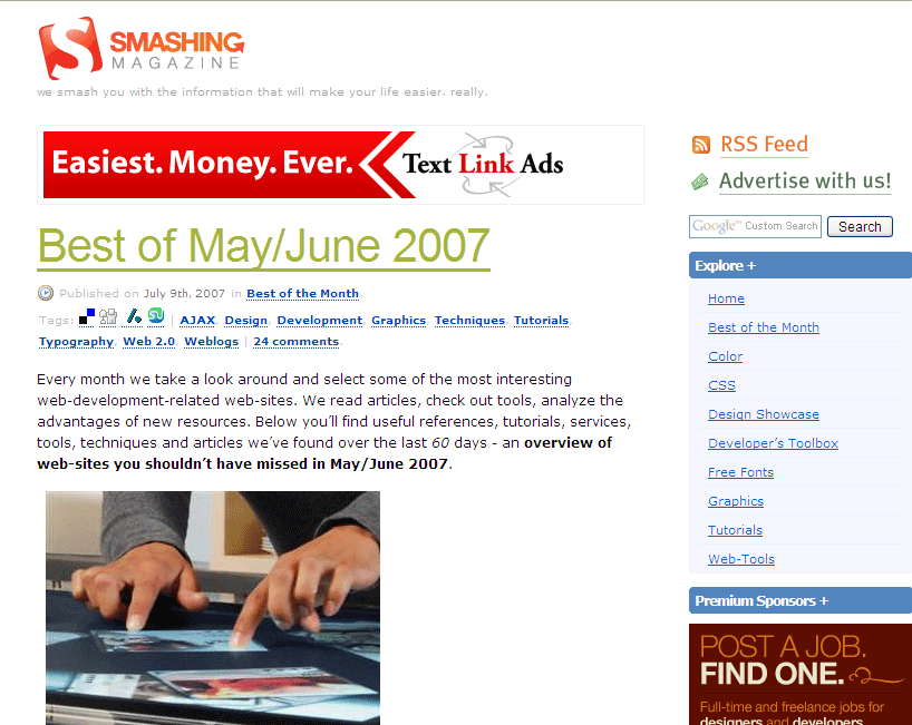
Last year we've seen a lot of simple, even minimalistic designs, which impress not with the amount of presented information but with the way the information is actually presented. Complex layouts are giving way to simple 2-col- or 3-col layouts, which usually have large amount of white space without any content whatsoever. Indeed, the importance of both white space and simplicity shouldn't be underrated. Used correctly, they can enhance the performance of a web-site, improve readability and make a great first impression. (Source: Smashing Magazine. By the way, this link has some excellent resources on white space and the simplicity of design.)
Smashing Magazine itself is a good example of white space:
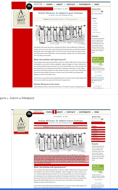
This author comments on the macro effect of adding white space in micro areas, particularly in a redesign of the Economist:
Whilst retaining the quirkiness of the original Economist typeface, Spiekermann redesigned it slightly, adding more whitespace to the individual characters. He then set the type slightly smaller and with more leading. All these changes added micro whitespace to the design. The overall result was subtle: the content was more legible and the overall feeling of the newspaper was lighter, yet the amount of content remained the same.
Though Spiekermann also added macro whitespace and color to The Economist his successful type redesign demonstrates that the space between the itty-bitty stuff can have a big impact on the effectiveness of a design—and this applies to design for the web as well. (Source: A List Apart)
Here's the author's graphic showing the difference between micro white space and macro white space:
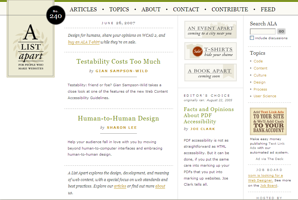
Here is the white space used on the A List Apart site:
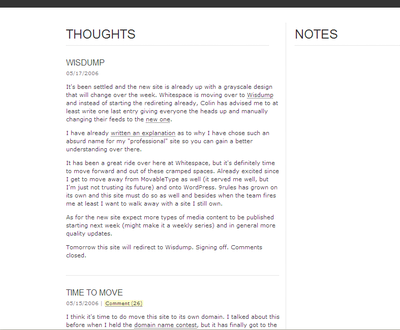
In reading about white space, I came across a blog with an abundance of white space. I'm not so sure the Notes column (with no notes) does much for the design, but if it did have some scribbles and highlights, it would be an appealing design.
Paul Boag talked about the importance of white space in this podcast (titled "Bulletproof"). He also wrote an essay giving advice on design for developers. Paul says:
Whitespace is the not-so-secret weapon of good design. For simplicity sake, I think the rule of thumb is to add more whitespace than you are naturally inclined to do. Whitespace improves legibility, gives a sense of simplicity and communicates a feeling of openness and style.
In order to limit scrolling, we feel the need to cram as much content in as possible so squeezing out whitespace. Resist this temptation. Be generous in your padding, margins and line height. Don't be afraid of "empty" parts of the screen.
Applying the Principle of White Space
White space is not just about increasing margins, paragraph spacing, and the space between sections. Expert use of white space maintains balance, provides a sense of elegance through simplicity, and focuses the reader's eye on a desired part of the page or screen. Most of all, white space provides a sense of breathing space for the viewer.
Do the sites you visit have much white space?
About Tom Johnson

I'm an API technical writer based in the Seattle area. On this blog, I write about topics related to technical writing and communication — such as software documentation, API documentation, AI, information architecture, content strategy, writing processes, plain language, tech comm careers, and more. Check out my API documentation course if you're looking for more info about documenting APIs. Or see my posts on AI and AI course section for more on the latest in AI and tech comm.
If you're a technical writer and want to keep on top of the latest trends in the tech comm, be sure to subscribe to email updates below. You can also learn more about me or contact me. Finally, note that the opinions I express on my blog are my own points of view, not that of my employer.