Home About Contact Podcasts WordPress Training

Nicely Designed WordPress Blog — Simple, Lots of White Space

July 2nd, 2007 | Posted in WordPress |

I stumbled across a well-designed WordPress blog yesterday. It has several qualities that make it stand out:

  • Ample white space
  • Simplicity of design
  • Contrast between headers and paragraphs

Nicely designed WordPress blog — White Space

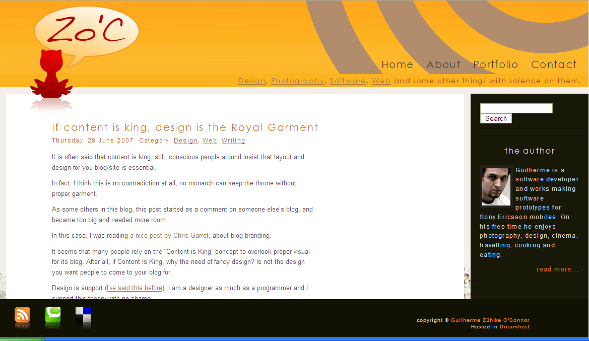
The ample white space and openness of the design is what I like the most. The cat in the upper-left corner (is it a cat?) and the author’s picture on the right also provides a nice balance.

Ample white space is a key principle of graphic design. I think often times we tend to jam layouts with as much text and graphics as possible, using all available space. In contrast, almost every time I see something designed by a graphic artist, the text is not crowding the space. Rather, the abundant white space draws the reader’s focus to the text.

Like this post? Subscribe to the RSS feed RSS Feed.


Related Posts


AddThis Social Bookmark Button

Comments

You can leave a response, or trackback from your own site.

7 Responses to “Nicely Designed WordPress Blog — Simple, Lots of White Space”

  1. Hi,

    Thanks for mentioning my design. Your design is also very nice, clear and light with colors in good measuse and a good amount of breathing space.

    The logo is that used to live on the top of my monitor before monitors got too thin to put something on their tops, but it became an almost abstract iconization of the Zo’C blog.

    Most people think is a cat, but there is no problem about this since most people seem to like it and is very unique :-)

    Cheers,
    Guilherme

  2. Yes, nice design, but the text font is too small for my old eyes.

  3. Personally I’m not a huge fan of the footer. I go to a blog because I want to read the text. If I want to subscribe to the feed or something, then I’ll look for the feed link/button/whatever.

    But the way that footer shouts at you and takes up so much screen real estate is quite distracting, in my opinion.

    However, I do like the rest of the layout. The only change I’d make is tame the footer by making it smaller, and not make it attack the user by expanding on hover.

  4. Guilherme, thanks for the comment. I like the “breathing space” term you used more than the word openness.

  5. Paul, I agree with you in part about the footer. I don’t mind its width, because it does frame the text. However, what’s the point of expanding its size when the user mouses over it? That seems perplexing. I’m also a fan of putting the RSS button near the top, where the user’s eyes naturally focus.

    Holly, re text size, although I personally don’t find the text size too small, I recognize that larger text on blogs is often a good move — case in point, Lorelle’s site at http://lorelle.wordpress.com. Her text is pretty large, esp. the blockquote font.

    I am starting to get more into design. I’ve discovered that if I have design in mind while flipping through a magazine, or while looking at other websites, everything jumps out at me in new ways.

  6. I just clicked through and took a look at that design and you’re right, it’s very attractive. The problem with the footer seems to have been fixed too, at least in IE.

    Fergus Mayhews last blog post..Nice Day With the Family

  7. I like blog layouts like this way better then those guys who try to go crazy adding as much “eye candy” as possible.

Leave a Reply