

Trying to Create Tech Writer Voices Logo
I've been trying to create a logo for Tech Writer Voices, but I'm not a graphic artist, so my logo looks pretty amateur.
My idea is to have something like this:
![]()
The above image comes from someone's Flickr stream.
But instead of the RSS logo, I thought I'd put in a globe. So I loaded Google Earth, captured a globe image, and then inserted it into some headphones that I got off of Microsoft clipart.
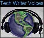
My idea behind using the globe is to emphasize the global nature of the technical writing community. So far, on Tech Writer Voices I've interviewed writers in Australia, India, South Korea, Canada, and the U.S. Listeners are also global.
The logo still doesn't emphasize the technical writer aspect of Tech Writer Voices. What icon symbolizes the technical writer? The old pencil might have once been the symbol of our trade, but I haven't used a pencil regularly for years.
Any ideas? If you have thoughts for the logo, please let me know. I want the image to communicate the focus of the podcast.
About Tom Johnson

I'm an API technical writer based in the Seattle area. On this blog, I write about topics related to technical writing and communication — such as software documentation, API documentation, AI, information architecture, content strategy, writing processes, plain language, tech comm careers, and more. Check out my API documentation course if you're looking for more info about documenting APIs. Or see my posts on AI and AI course section for more on the latest in AI and tech comm.
If you're a technical writer and want to keep on top of the latest trends in the tech comm, be sure to subscribe to email updates below. You can also learn more about me or contact me. Finally, note that the opinions I express on my blog are my own points of view, not that of my employer.